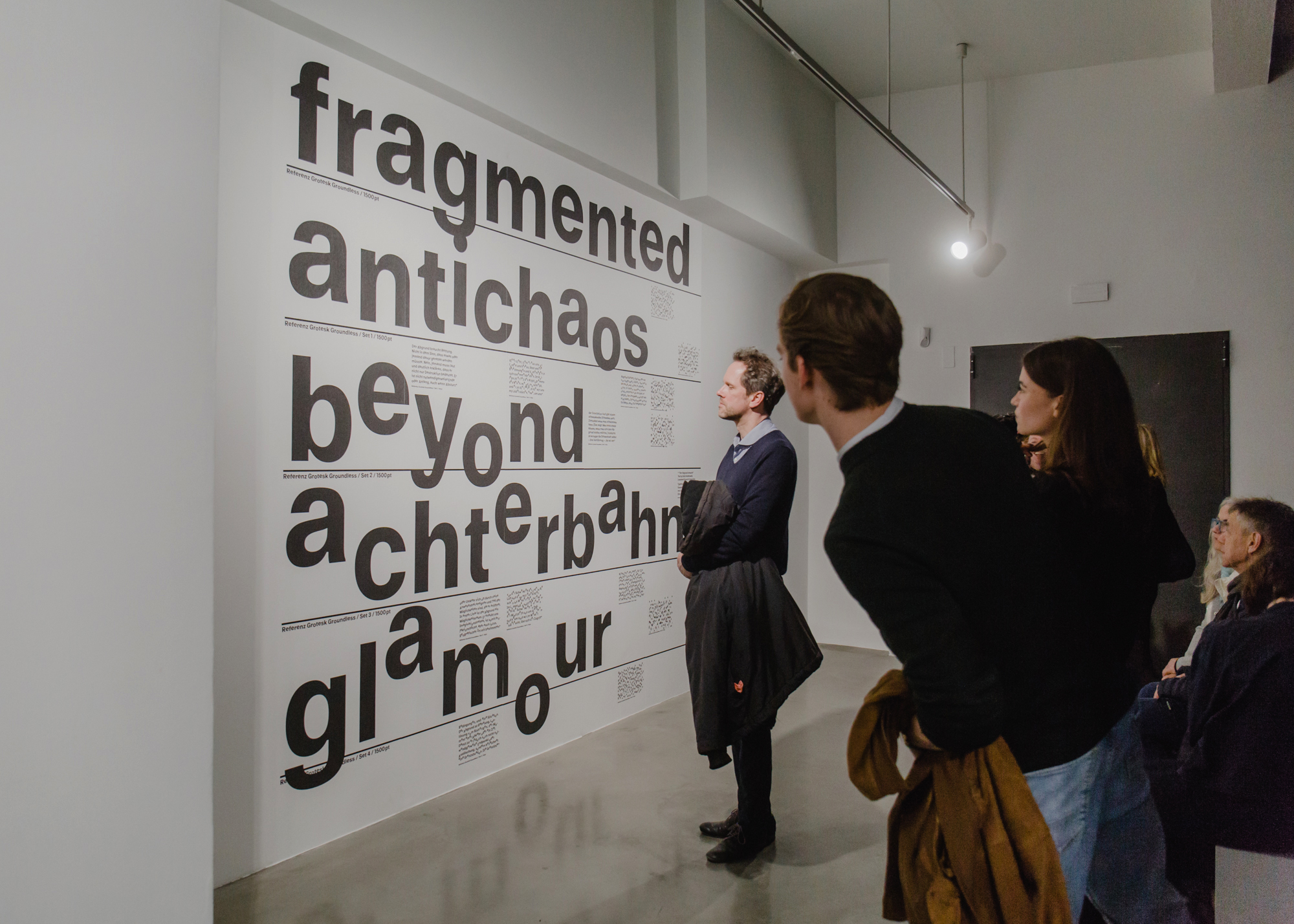
The group exhibition Iliggocene – The Age of Dizziness (KINDL – Centre for Contemporary Art, Berlin) includes artworks from the fields of photography, video, drawing, painting, light art and sound, next to an artwork from the field of typography and type design.
For the latter, we were invited by the artist duo and curatorial team Anderwald + Grond, as well as Sergio Edelsztein, to develop an artistic-typographic contribution. The exhibition, with the overarching theme of “Dizziness”, explores the multiple crises of the present day and the experience of a perpetual state of emergency characterised by a lack of language and other forms of connection. It showcases artists’ positions that propose new vocabularies for these states of dizziness.
In the beginning, we asked how dizziness can be translated to the field of typography and type design. Can a typeface make us dizzy? Can certain type forms provoke a feeling of disorientation and confusion by interfering with the reading flow? By spinning, slanting, shifting and fainting letterforms to different extents, we have been testing various types of disruptions. Finally we have decided for a simple yet quite effective method: the baseline shift. By doing so, we have created a type system with different states of dizziness via glyphs that we have decided to shift from their baseline (usually a fixed constant in type design) at different levels.
A typeface with different states of dizziness